There are many values within our Episcopal / Anglican tradition that inform our life together. One of those values is the multitude of aesthetics and styles that exist within our community. This presents a challenge to any of us who would seek to faithfully represent our faith through visual means, or to use our shared perspective as a guiding voice in aesthetic decision-making. To narrow the scope of our guiding Anglican values we landed upon: Beauty, Tradition, Clarity, and Stewardship. Though these are not solely the property of Anglicans, we hope that they can give some spiritual and institutional guidance to the choices we wish to make.
In honor of our 80th anniversary, Episcopal Charities has been working to pay homage to its original, classic look. We have simplified again and streamlined our design and logo. This is in part an homage to our founding, but also an effort to be better stewards of our resources, as black ink is much less costly than full-color printing.
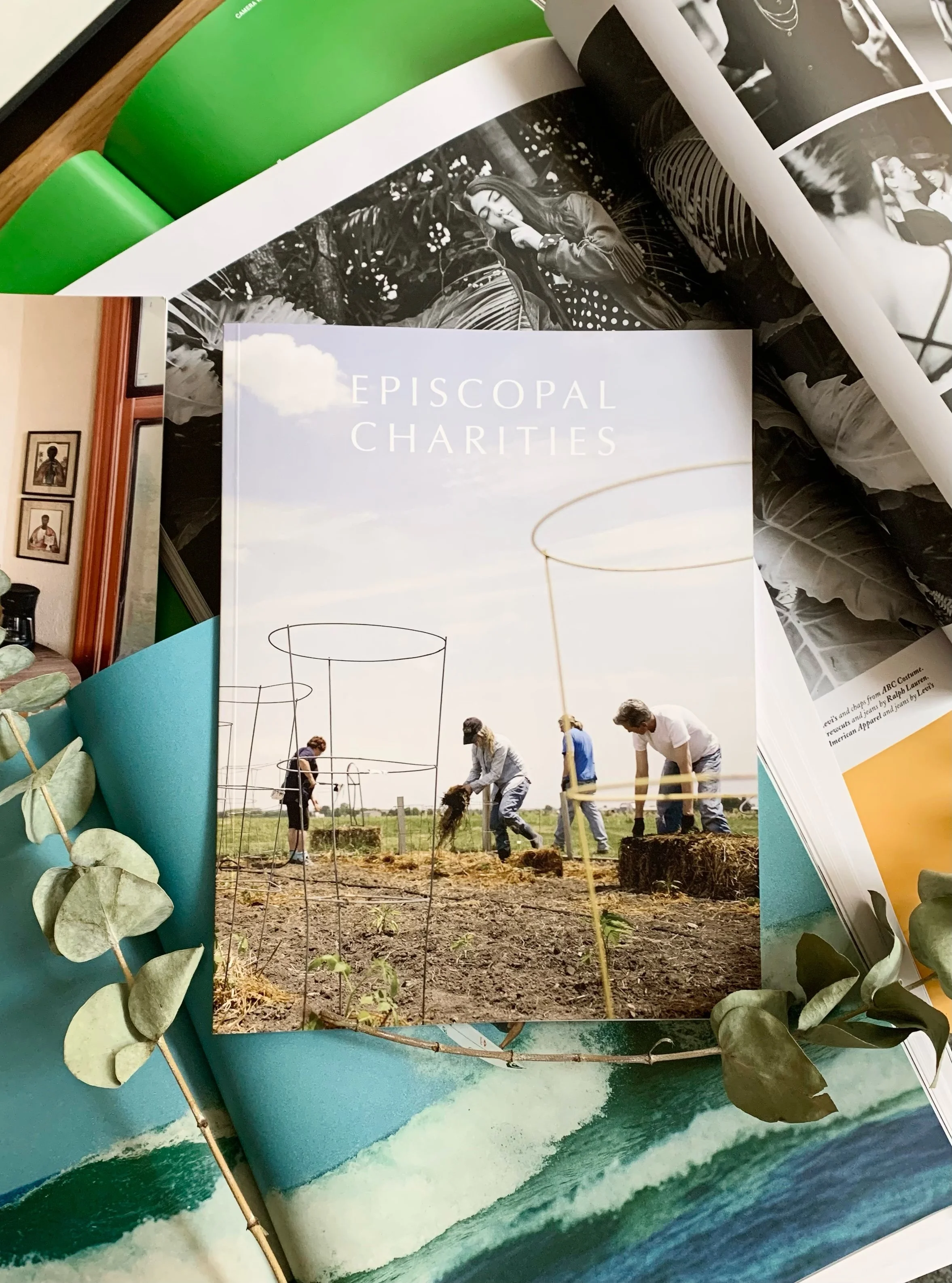
We have retained our original typeface (or near to it), Baskerville, and soft white / off white paper stock that references the aging of paper (which conveniently according to our printer is 80% more likely to be opened when received in the mail).
Here is a glimpse at our former branding:

Our logo in 1966

Our logo in 1983 with the seal of the Diocese of Chicago

Our Branding and website in the 2000’s
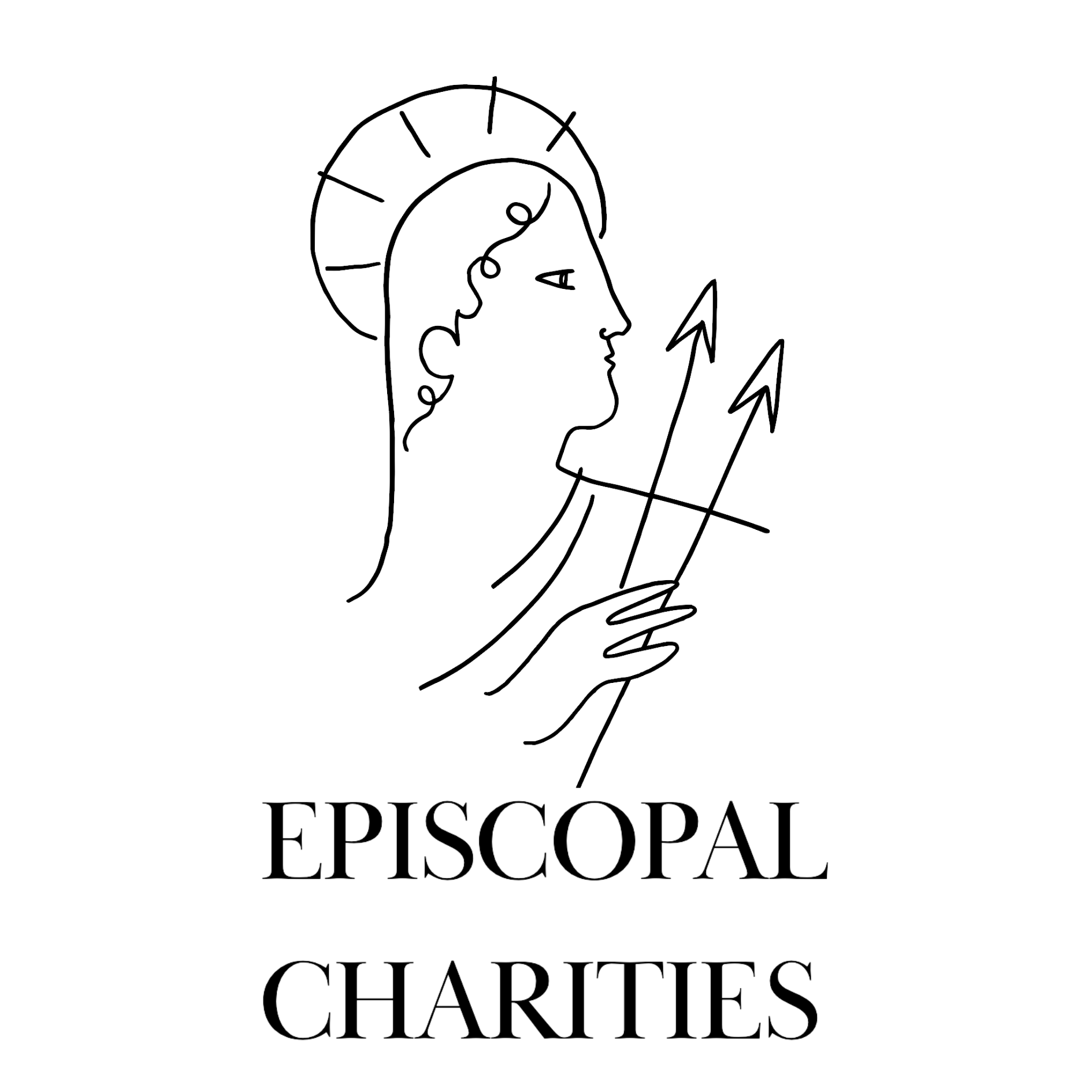
The recent changes made were simple in scope: a return to “Episcopal Charities” as our organizational title, a continuation of use of the Baskerville typeface, and a lessening of use of the mosaic logo.
Eliminating the mosaic logo is in keeping with world-wide marketing trends around the “un-branding” of organizations… allowing Episcopal Charities to be known for who we are and what we do, and eliminating flashy or distracting symbols that compete with our name and message.
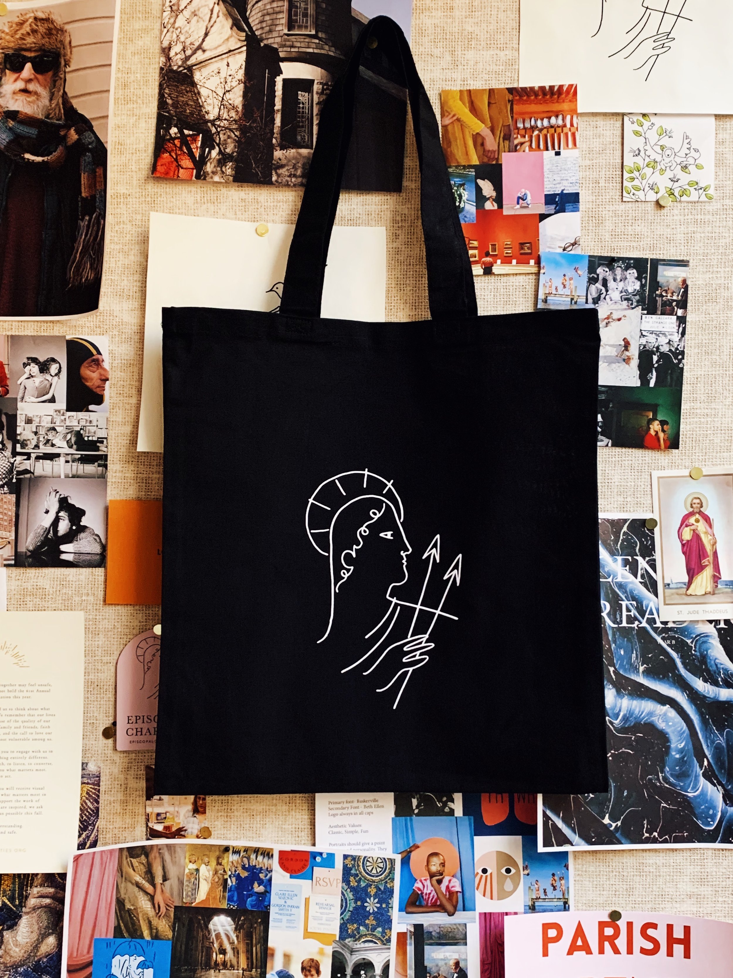
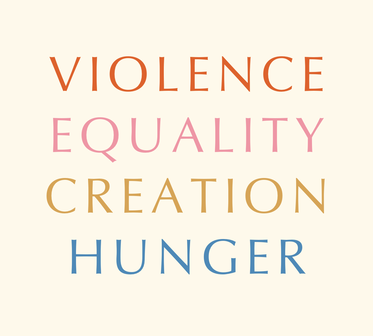
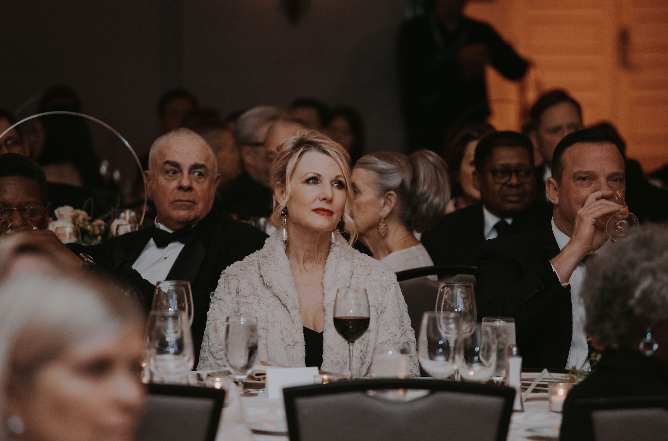
We have simplified our branding because we want our work and our message and the faces of those we support to shine through in the minds and hearts of those who interact with us. Clarity of image is a piece of strategically communicating our mission.


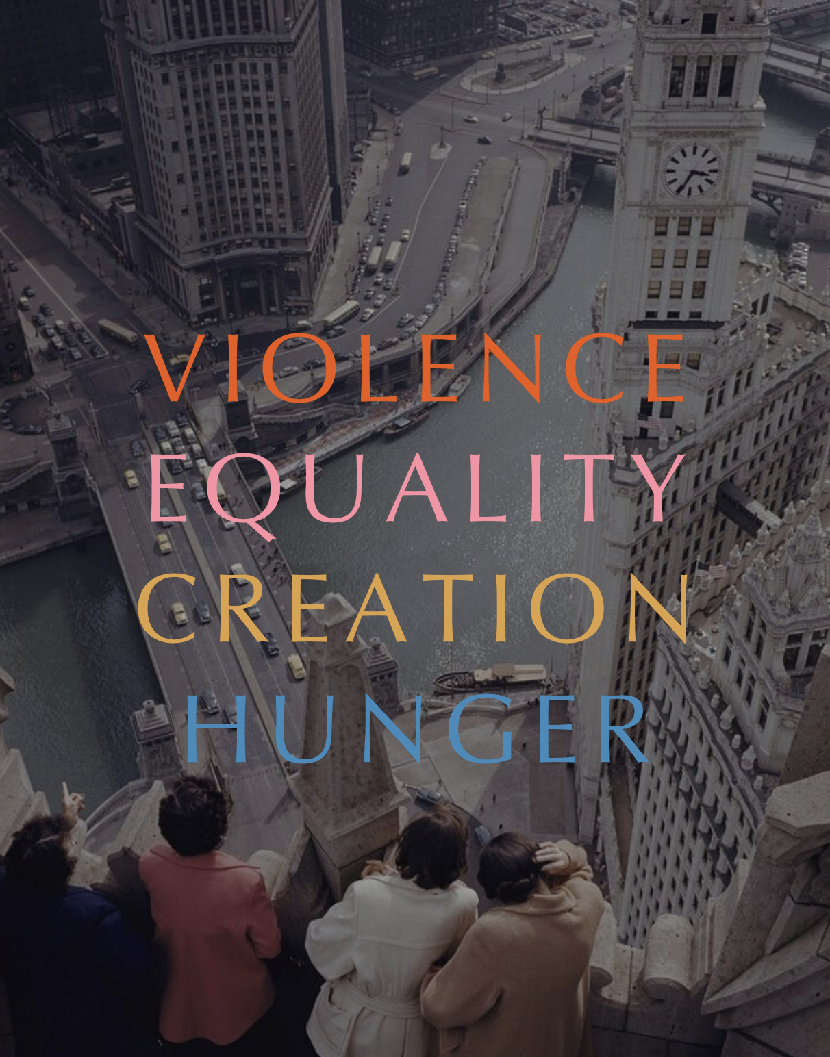
Episcopal Charities shares with the Episcopal Church (and Anglican Communion worldwide) a dedication to the beauty of our faith. To that end, we seek to use visual elements and imagery that invite us deeper into our spiritual journeys and spur us toward both contemplation and action.
These are ideological values, but also values that inform our visual language. We seek to be clear in our visual communication; to be succinct and transparent. We also aim to utilize visual imagery (photography and illustrations) that invite us toward awe, reverence and a sense of wonder.
In 2023 we made a further adjustment to use the font “Optima” as our logo font instead of “Baskerville”. EC Also added “Mezalia as a secondary font.